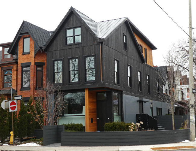
I showed you a pic of construction going on at this site in 2018 (HERE) but didn't get by again for a couple of years when I took this pic in 2020. The building had been a corner store which was changed into residential dwellings. Unfortunately when I saw it there were beige marks all over the black wooden surfaces. I wonder if these were the locations of knots in the wood which had repelled the black stain. I'll show you a recent update tomorrow.

17 comments:
It looks big.
Interesting. I like the contrasts.
Will be super interested to see latest shots Pat ✨
Quite a sympathetic modernisation, though a shame if the smart black cladding doesn't wear well.
They did a great job on this house. It looks very attractive.
This looks like a fine restoration and reimagining of an historic building, perfect for the neighborhood.
Beautiful building. The color is also nice.
Not sure whether I like that black stain or not, but it's certainly an eye-catching conversion job.
I like the look.
...they sure shoehorned it in!
Hello,
I like it, looks like a nice conversion.
Take care, have a great day!
With those windows it could almost pass as contemporary construction.
I think they did a tasteful job, Pat.
Nicely done! I was familiar with the neughbourhood between UofT and Casa Loma, even if I don't recognize individual houses, so I enjoy these.
It's quite attractive.
I like it! I really love the black stain with the natural wood. Nice architecture too.
What a beauty it is! They sure had an eye for what looks tastefully complete!
Post a Comment